AboutMyRoad - Design
Simplicity is the defining mantra for the UI. The target audience is demographically weighted towards a 30 plus age group and needed a UI that didn’t need prior experience of using apps.
This means the UI should not rely on advanced gestures or unusual design elements.
The user comes first. Period.
Approach
User actions were documented in the product backlog as stories which began the thinking process of what the user wanted to do, into how it’s done. Features were prioritised and grouped when they relate to each other and with an overview, a coherent journey evolves.
I took a look at what other people were doing with their approach. I needed screens to be impressive through offering simplicity, ease of use, clarity and look good. I needed to be impressed!
I used storyboarding first, to envisage what a screen could do and how a user would use it. I ran through the screens with other people and explained each step of the journey - what it did and why it’s there.. You then take feedback and without ANY prejudice - make it easier to understand, easier to use, remove barriers and go through the cycle again.
Some questions that really helped when reviewing each screen were:
- What does the user know at this point?
- What does the user want to do?
- Does every artifact on the screen deliver a relevant and valuable action or confuse?
- Is the navigation obvious?
- Is there anything that needs an explanation?
- Is there anything hidden?
After a lot of refinement a storyboard evolves that visually delivers user actions that is simple, clean and understandable. The storyboard is mocked up - at this point it’s quicker and easier to change a graphic than code behind a real screen.. The diagram below is more polished than my sketches on numerous pieces of paper!
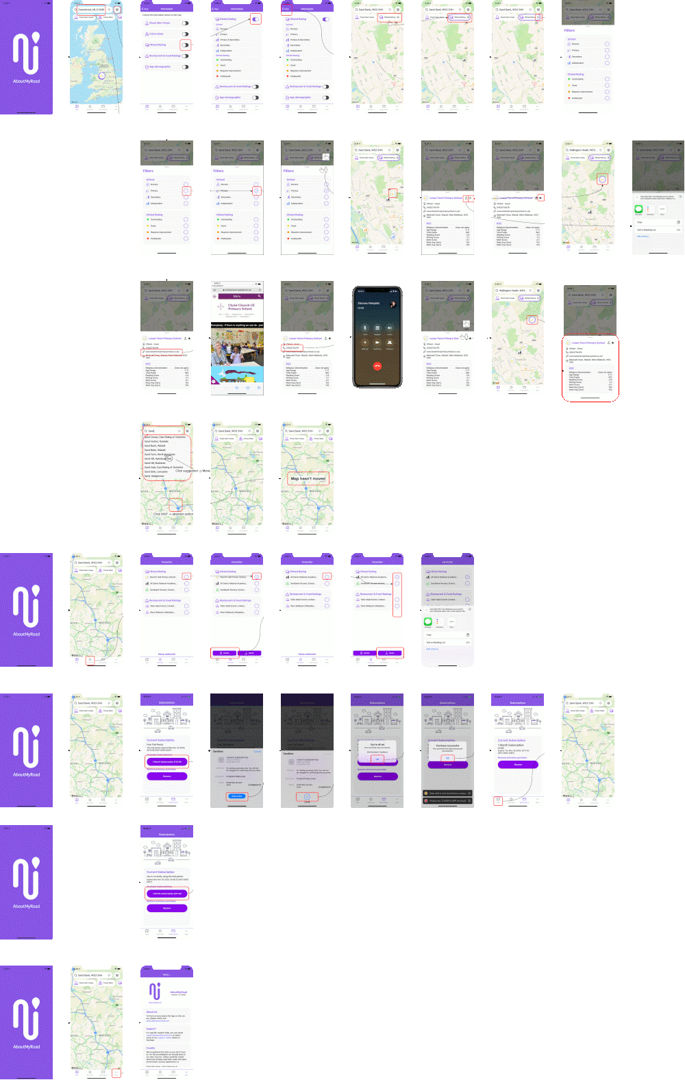
With a mocked up screenflow that I believed delivers both a functional and usable experience I could code screens. Coding a screen at a time and reviewing the outcome with friends helps to ratify the work and sometimes it does mean taking a different approach. using a real screen is very different talking through a screenshot.
Notable Features
Here are some of the features that evolved from reviews by prioritising usability first.
Map Positioning
Alongside repositioning the map using your finger you can also type in either a location or postcode. Allowing local place names widened the available locations to less formal but better known terms. On every key-press suggestions are provided that include the postcode to help the user choose the right location.
Category Carousel
A carousel was chosen for easy access to the different types of information with each entry performing as a button, turning on and off the inclusion of the data in the map and a quick path to filtering the data sought.
Swiping left or right reveals more categories and this is visually prompted by not providing borders on either side - it looks like there’s more to see.

Switching the border of the button is used to indicate if the information is painted on the map.
Using an ‘options’ style icon within the button is used to access filters or options for the information being displayed.

Icons & Colours
Icons were chosen to be simple and easily identifiable shape and colour coding was used to represent the government official rating awarded to the location. A selection is shown below:
| Icon | Use |
|---|---|
 |
Colour used for outstanding/Excellent rating |
 |
Colour used for acceptable rating |
 |
Colour used for ‘needs improvement’ rating |
 |
Colour used for ‘serious attention’ rating |
 |
Health clinic |
 |
Hospital |
 |
Doctor |
 |
Carehome |
 |
Primary School |
 |
Primary & Secondary School |
 |
Secondary School |